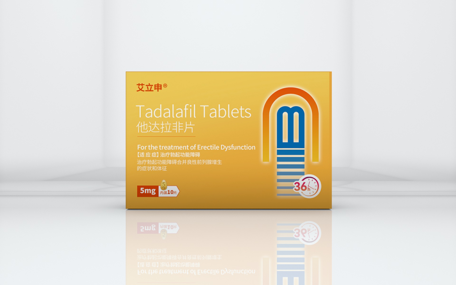
This project focuses on the packaging design of Tadalafil Tablets, a prescription medication. The visual direction centers on professionalism, clarity, and strong shelf recognition. A warm gradient of golden yellow is used as the primary color, conveying both the medication’s gentle properties and its positive therapeutic effect while enhancing visibility in clinical and retail environments.
The front panel highlights the drug name clearly in both English and Chinese, using clean sans-serif typography to ensure immediate readability. The graphic element on the right presents an abstract symbol representing the medication’s duration and efficacy, while the “36h” icon helps users quickly understand its long-lasting performance.
Key information — including dosage (5mg), quantity (10 tablets), and indications — is emphasized to meet pharmaceutical standards of accuracy, compliance, and user-friendly communication. The final design is clean, modern, and trustworthy, achieving a balance between professional medical aesthetics and practical user needs.
本项目为处方药品 Tadalafil Tablets 他达拉非片 进行包装设计。整体视觉以“专业、安全、易识别”为核心原则,采用明亮渐变的金黄色作为主色,传达药品的温和属性与积极功效,同时提升货架识别度。
包装正面以清晰的中英文药名为视觉主轴,搭配稳重的无衬线字体,使关键信息在第一视线中更易被识别。右侧图形通过抽象图形符号化呈现药物作用时间与持续效果,36h 图标帮助用户快速理解产品功能特点。
设计中强化了剂量信息(5mg)、规格信息(10片)以及适应症描述,满足医药包装对严谨性、合规性与易读性的要求。整体风格简洁明快,兼具专业性与用户友好度,使产品在医药类货架中更具信任感与辨识度。